
The Long Landing is a long-running project about the next seventy-five years of climate change: what the hot branch of the IPCC’s scenarios would mean, decade by decade and place by place. New pieces are published in the Newsroom as they become ready. This page is the reference for what exists, what is under review, and what is planned. It updates automatically based on what has been published.
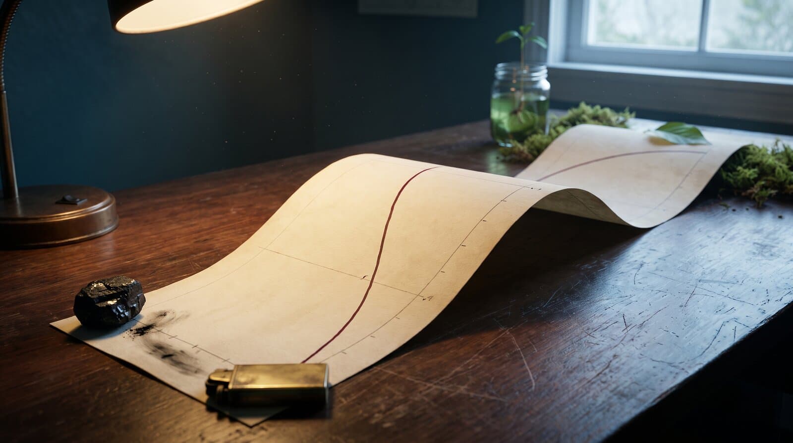
The timeline, published in August 2026, plays out a scenario from 2026 to 2100. It contains sixty-seven entries across five eras and six themes. Each follows the same chain — premise, cause, consequence, and conclusion — while the temperature and CO₂ levels implied by the scenario are drawn overhead as you scroll. It deliberately follows the hot branch: 2°C of warming in the mid-2030s, 3°C by mid-century, and about 4.4°C by 2100.
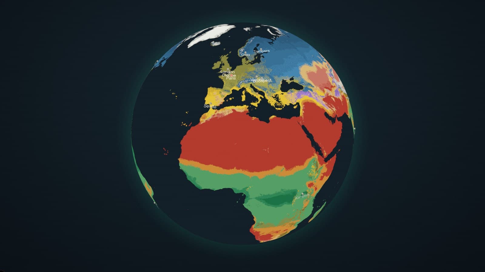
The globe puts the same clock on one Earth. Fifteen layers — climate zones, five kinds of heat, four aspects of water, staple crops, El Niño, sea temperature, livability, and permafrost — can be explored from 1901 to 2100. Each is built from public data and keyed to the same warming curve. The twenty-one cities featured in the series are also marked on the globe.
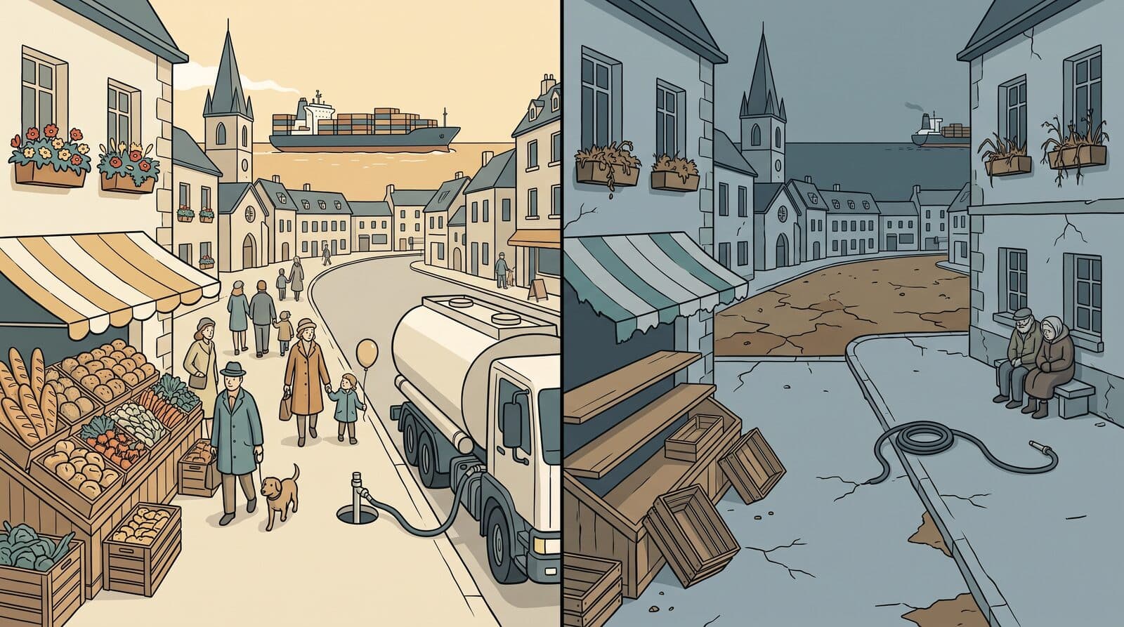
The city series brings the globe down to the local level, one city at a time — Paris first, followed by twenty more, from London to Tahiti. Each article presents figures established through research into that city.
Everything is built from established public sources: NASA’s NEX-GDDP-CMIP6 daily projections, Copernicus, WorldClim, WRI Aqueduct, FAO/IIASA GAEZ, NOAA, the Köppen–Geiger maps by Beck et al., ESA and AWI permafrost data, and WorldPop. Together, these sources amount to about 65 gigabytes of material, reduced to the frames shown on the globe.
The result is a data visualisation, not a new climate model. The methods and their limitations are explained at the bottom of each piece. Every piece also undergoes fact-checking and an adversarial review before publication.
Where it stands
The count is generated from what has been published each time the site is built.
2 of 23 published · Latest: The globe, 5 September 2026
2026 to 2100, played forward — 67 entries across five eras, with the temperature and CO₂ levels implied by the scenario drawn overhead.
Open →The same century on one Earth — 15 data layers you can spin and explore from 1901 to 2100, with the 21 cities marked.
Open →One article per city, published in the order in which the research is completed. Each city will link to its article once published.
- Paris
- London
- Seville
- Budapest
- Vienna
- Oslo
- Montreal
- Lima
- Kampala
- Tampere
- São Paulo
- Dieppe
- Bangalore
- New Delhi
- Islamabad
- Shanghai
- Beijing
- Taipei
- Tokyo
- Sydney
- Tahiti
live in review planned
New pieces appear in the Newsroom as they publish; this page is the reference.
Tech Stack
Key Features
- ✓Interactive timeline covering 2026–2100: 67 entries, five eras, six filterable themes, and sourced explanations
- ✓Temperature and CO₂ curves drawn overhead as you scroll, comparing the scenario with current policies and strong action
- ✓Globe with 15 data layers, explorable from 1901 to 2100, using one warming clock for every layer
- ✓Every layer built from public data, with its own legend and a plain-language explanation of what it shows
- ✓The 21 cities in the series marked on the globe, each linking to its article as it is published
- ✓Six shared milestones — 2026, 2033, 2042, 2050, 2070, and 2100 — across the timeline and globe
- ✓Sources, methods, thresholds, and known limitations explained in every piece
- ✓Fact-checking and an adversarial review before every piece is published
- ✓The status on this page generated at build time from what has been published
Challenges
Sixty-five gigabytes of daily climate projections cannot fit on a web page. Each layer is therefore processed offline: daily NetCDF grids are reduced to yearly indices, the indices to a small number of frames keyed to warming levels, and the frames to palette-based textures that a phone can load. The viewer moves to the nearest available frame rather than inventing values between them.
The more difficult challenge was presenting the data honestly. Datasets with different baselines, models, and end dates had to be aligned with one warming curve without claiming more than each source supports. Every description on the globe also had to explain, in plain language, what the layer shows and where its data ends.
The final check is human. Each piece is fact-checked and reviewed adversarially before publication, and climate scientists are invited to identify anything that may be wrong.
The Long Landing in the Newsroom
Every published piece of the project, newest first — the timeline, the globe, and the city articles as they go live.
Other Projects

Orchemist — Orchestration Engine
Live — orchemist.com
Text Grand Central
V3 Engine Complete — UX Features in Progress
The Door
Live — connylazo.com
Toscan — AI Chief of Staff
Running 24/7
Rule #1 Investment Analyzer
MVP Complete — 27/27 Stories
Executive Project Dashboard
Live — GitHub Integration
ISO 27001 Automation
In Production